THE BRAND COLOR APPEAL
- Daisy
- Jun 15, 2020
- 5 min read
Updated: Jun 6, 2023
Color Color what color do you choose? We often tend to make color choices, even when we don’t realize. But unlike the usual times, choosing the color best for your business can be challenging.
But don’t worry, color theory has never been a rocket-science. This 3 min read will help you understand colors better and also let you choose the Best color for your Brand.
Did you know? A Human eye can see approximately 10 million colors .... But the ability to detect and discriminate color varies from person to person. And here’s why primary colors come into the picture.
Out of 10 million colors, most human beings get attracted towards the Primary colors - Red, Blue & Yellow.

Now why these colors are known as primary colors is because they are independently formed and are also the parents of any other color that could be possibly made.
When these three colors are combined in equal parts, they create secondary colors such as green (by combining yellow and blue), purple (by combining blue and red), and orange (by combining red and yellow). Primary colors cannot be formed by mixing other colors together. Therefore, these three colors are considered the building blocks of all the other colors in the visible spectrum.
Here's a simple Pictorial representation of the color wheel:

The inner triangle in the picture depicts the three primary colors and and the outer three triangles depict the secondary colors (which are formed by mixture of primary colors)
Tertiary colors are the mixture of primary and a secondary color.
Fun Fact: Human babies see only in black and white after the first 90 days of their birth. The next color that they start seeing is Red.
A) Why is choosing the right color so crucial for business?
The eye catches color before anything else. The right balance of tones,shades and hues is crucial to ensure that the eye stays on the color for a longer time.
"A good color appeal can draw human attention from a competitors brand to yours"
Remember, that a color well known to the public makes the product acceptance faster and gains trust. ''A bad product with good color scheme sells faster than a good product with bad color scheme’’ To catch the customers attention, you will HAVE to have a color that is appealing and versatile all at once.
When choosing colors for your brand or products, consider the emotions and meanings that are associated with each color. For example, blue is often associated with trust and loyalty, while red is associated with passion and energy. Think about the message you want to convey and choose colors that align with that message. It's also important to consider the context in which your product or brand will be seen. Your color scheme should be appropriate for the industry and target audience. For example, a bright and playful color scheme may work well for a children's toy brand, but may not be appropriate for a high-end luxury brand. Overall, the right color scheme can make a significant impact on the success of your brand or product. Take the time to research and choose colors that will best represent your message and resonate with your audience.


B). Color Theory and Psychology.
The top 5 universally acceptable colors are:
a) Red
b) Blue
c) Yellow
d) Green
e) Black
These colors are very easily recognized and remembered by the majority public. But the Cherry on top is , these colors are very easily printable without actually losing its tones and identity.
If your brand doesn’t go well with these top 5 colors, you can also opt for Orange and Purple. These colors also do not trouble printing so much and have a record of good acceptability. It is important to note that the choice of color also depends on the industry and target audience. Different colors evoke different emotions and associations, so it is essential to consider the context of your brand before finalizing the color scheme. For example, red is commonly associated with passion and energy, making it a suitable choice for the entertainment industry, while blue is often linked to trust and reliability, making it an ideal choice for finance and healthcare.


C) Usage of Colors
The color usage of your brand can either be bold or brash, subtle or sophisticated or anything in between. But, a good balance of contrast can draw attention quicker and hold it too. Remember, the main color that you pick for your brand will majorly appear on your website, signboard, advertisements, visiting card, letterhead and many more. Make sure you don’t choose a color that you can get bored of easily. It's also important to use colors consistently across all brand assets to create a strong visual identity and increase brand recognition. This means adhering to a color palette and using the same shades and hues across all materials.
Overall, choosing the right colors for your brand requires careful consideration and a thorough understanding of your target audience and the emotion that is associated with your brand. Invest time and effort into this decision to ensure long-term success and recognition for your business.
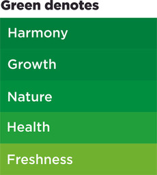
Here’s the example to how color psychology works:


DID YOU KNOW?
10 FUN FACTS ABOUT FAMOUS BRAND COLORS:
The red color of Coca-Cola’s packaging is trademarked! The company had to go through a lengthy legal process in 1890 to establish its signature red and white color scheme as a protected trademark.
The bright yellow used by McDonald’s is meant to be eye-catching and evoke feelings of happiness and friendliness. It also is a color that stimulates hunger in people.
The iconic green used by Starbucks is known as “Starbucks Green” and was inspired by the green found in coffee farms.
Tiffany & Co.’s signature blue shade is trademarked and known as “Tiffany Blue.” It was first used for the cover of their Blue Book catalog in 1845, and has been associated with the brand ever since.
McDonald’s iconic golden arches are yellow because it’s a color that stimulates hunger and happiness in people.
The color pink used by Barbie dolls is also trademarked as “Barbie Pink.” It was chosen to represent femininity and glamour.
The black and white logo used by Adidas represents the brand’s focus on simplicity and elegance. The three stripes were originally added to provide extra support for athletes but became an iconic part of the brand’s design.
The red used by Ferrari on its classic sports cars is known as “Rosso Corsa” or “racing red.” It was chosen to represent Italian racing heritage and passion.
The black and white logo used by Chanel represents elegance, simplicity, and timelessness.
The gray color used by Apple on its products is called “Space Gray.” It represents sophistication, modernity, and high-tech innovation.


Hope you found these additional fun facts interesting! Overall, colors can play a big role in helping brands stand out and create a recognizable identity. So its crucial to know how to choose a color that best represents your brand personality.
To Conclude, the success behind a brand is marked by a good choice of color and a prominent logo.
Reach us out over email: flgche@yahoo.com / Mobile: +919841115211


Comments